Showing posts with label analysis. Show all posts
Showing posts with label analysis. Show all posts
Tuesday, 27 November 2012

Saturday, 24 November 2012
Saul Bass write up

Saul Bass was an American graphic designer. He is one of the most recognised and revolutionary title sequence and poster designers in the film industry. Before Saul Bass' work title sequences were often very basic and reminiscent of end credits; where the names just roll up on a plain background. Bass' colourful, simple geometric shapes were often symbolisms which, even on their own delivered a powerful messages. His work changed the way title sequences were viewed forever, as from then on they were much more creative and visually stimulating.


Saul Bass was born on the 8th of may 1920 and he studied at the Art students league in Manhattan later in his life. He then worked as a freelance graphic designer in his early career, before he worked on bigger films. He was so popular because he had the ability to capture the mood of the whole film using only simple shapes and lines. He has designed posters for many famous films and they all have a similar look making his work iconic and easy to spot. He also ended up producing over sixty title sequences. He had many great collaborations with familiar and famous directors such as Alfred Hitchcock and Michael Scorsese, making his work more widely recognised. He changed the way people viewed title sequences by making title sequences something that not only stated names of crew and cast and the name of the film, But something that presented them in a creative way. Often Bass' title sequences held metaphors that suggesting what would happen during the film, or it being a synopsis of the while film itself.
Sunday, 18 November 2012
Halloween 3 analysis
 At the beginning of the Halloween 3 title sequence a flickering effect is visible. This reminds me of a old fashioned television and therefore suggests that something is going to be portrayed to television viewers. Also, it could suggest that a television has some sort of importance somewhere in the film. The flicker is also symbolic for mystery as you can not see what is actually going on and therefore it will be hard to work things out.
The music in the first part of the title sequence is very high and quite distorted, and doesn't seem to fit in with the film's genre. This could suggest that this film may be unexpected and have scenes that you have never seen before in horror films. The blue text and the orange background are quite contrasting colours connoting that things wont match up in the film, also suggesting mystery.
The music changes into a quite low hum which sounds dark and mysterious suggesting what the mood and tone of the film is going to be. The music conveys the genre the most due to the distorted and mysterious/atmospheric music making the whole scene more creepy. It makes the audience quite tense as they can't tell what it happening and the music adds to this tension.
Another point is that throughout the whole of this sequence, something is slowly being revealed to us using the orange lines. We don't find out what it actually is until the end suggesting that this might be the case in the film; that small parts of a mystery are shown to us throughout the film but we don't find out the answer to it until the very end. The fact that the orange lines are then being cut out again could maybe suggest that there maybe stabbings in the film as the cutting of the lines could resemble a character being cut.
The colour orange shown throughout the sequence is always linked to halloween, which is the name of the film too. So, if someone didn't know what the film was called the colour orange could suggest the theme of halloween to them. This along with other features too, such as the music and the fact that the end image is of a jako lantern.


as you can see here, the building up of the orange lines create a jako-lantern, shown at the end.
Saturday, 17 November 2012
Captain america analysis
Captain America: The First Avenger
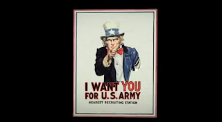 We instantly know as soon as we start
watching the title sequences that it will be set in wartime as we are
shown an iconic poster of Uncle Sam pointing at us. At that point we
will also know that it will be set in America as this is an iconic
American poster and Uncle Sam is an iconic American figure. The music played sounds quite heroic
suggesting it could be about a war hero. It also sounds adventure-y
connoting it could have adventure features. It’s quite an upbeat
song that doesn’t sound dark which suggests that it’s not going
to be a dark film. The music could be considered quite fanfare like,
which is associated with wartime and going to war linking in with
what I said earlier.
We instantly know as soon as we start
watching the title sequences that it will be set in wartime as we are
shown an iconic poster of Uncle Sam pointing at us. At that point we
will also know that it will be set in America as this is an iconic
American poster and Uncle Sam is an iconic American figure. The music played sounds quite heroic
suggesting it could be about a war hero. It also sounds adventure-y
connoting it could have adventure features. It’s quite an upbeat
song that doesn’t sound dark which suggests that it’s not going
to be a dark film. The music could be considered quite fanfare like,
which is associated with wartime and going to war linking in with
what I said earlier. Near the beginning a shot of three
hands are held together in the middle, which suggests teamwork. Also,
they are all wearing different costumes; one is wearing a work glove,
one is wearing a suit and one is wearing an American flag costume,
which could also suggest that people from all different classes are
coming together and working together. This could suggest an
underlying theme of the film too – teamwork.
Near the beginning a shot of three
hands are held together in the middle, which suggests teamwork. Also,
they are all wearing different costumes; one is wearing a work glove,
one is wearing a suit and one is wearing an American flag costume,
which could also suggest that people from all different classes are
coming together and working together. This could suggest an
underlying theme of the film too – teamwork.
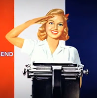
Carrying on with the theme of war, we
are shown a number of army looking aeroplanes,
suggesting/foreshadowing that there could be some action scene
involving aeroplanes somewhere throughout the movie. The fact that a
woman saluting is shown could suggest a romantic element perhaps, and
the fact that she is saluting could suggest she is part of the
team/army.
 Around the middle of the title sequence
we are shown a hand in a glove with a wrench, this could suggest that
there is some sort of manufacturing element somewhere in the film.
Also the fact that it is working on the 'O' in the word 'production'
suggests the making/ manufacturing of something which could have
significance during the movie. The significance of the 'we can do it'
poster could be significant as it could relate to the teamwork
feature again and the fact that it's a woman could suggest that a
woman succeeds in doing something important. The showing of many
flags of the world could connote that many countries are involved
throughout the film, and the fact that the USA flag is at the front
shows that it is the main country and maybe the most important
throughout.
Around the middle of the title sequence
we are shown a hand in a glove with a wrench, this could suggest that
there is some sort of manufacturing element somewhere in the film.
Also the fact that it is working on the 'O' in the word 'production'
suggests the making/ manufacturing of something which could have
significance during the movie. The significance of the 'we can do it'
poster could be significant as it could relate to the teamwork
feature again and the fact that it's a woman could suggest that a
woman succeeds in doing something important. The showing of many
flags of the world could connote that many countries are involved
throughout the film, and the fact that the USA flag is at the front
shows that it is the main country and maybe the most important
throughout.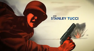
The fact that an explosion illustration
is shown could foreshadow events that happen later in the film. Not
only this, the colour red, used on the person at this point signifies
danger and evil, but it could also suggest a romantic element in the
film.
'what about a nice hot cup of freedom?'
could signify something in the film, perhaps someone gets a sense of
freedom from doing something. The fact that this is shown could maybe
show that it's important.
The fact that all the different parts
of the title sequence join up in some way could show a sense of
merging between characters and that different people will join up
together.
Overall, I think most of the things
shown in the sequence were shown for foreshadowing purposes, to
subtly let the audience know what might happen during the film. Also,
to set the setting, the period of time and the genre.
Friday, 26 October 2012
Zombieland Analysis
The blood and nudity shown in the opening sequence will make the audience realise that this will probably be echoed in the rest of the film. We know it will be quite gory, risky and maybe even controversial, as some people may get offended by the things shown. This is probably why some gory/nude things are shown in the opening sequence, maybe as a warning what will come up later in the film.
The titles and credits are in a red bold font, the red could suggest death, blood or danger. Also they look quite interactive as when the characters run/fall in them they look as if they are smashing. This could suggest the action that will happen throughout the film as a lot of things will probably get smashed up. In the first scene the title is placed as if it is the sign on the outside of the building too, which is quite clever, but also discrete.
By the time we've seen most of it we will probably establish that the genre is Zombie-Comedy due to the music and the editing mainly; the slow-motion editing looks quite humorous and comedic and the fact that the people are getting chased by the zombies. Due to the slow-motion we can see their facial expressions more which is quite funny.
The film looks as if it is set in an american city as there are lots of features that big cities have; prison at the beginning, fire department, school, strip club etc. The fact that it looks quite bright/sunny/hot there also confirms the location. The fact that it is so bright could contrast with the quite dark main feature; zombies. This could also add to the comedy feel of the film. The film looks quite modern, so it could make audiences imagine if that would be what it would be like if this happened now in real life.
This opening is quite good as raising enigmas as we are only shown clips that are in the peak of action and we don't know how it got to that point or how the zombie virus came about, so will we hence want to watch the rest and find out.
Subscribe to:
Posts (Atom)