Sunday, 18 November 2012
Lesson Three: Preparing our pitch.
We prepared our pitch for our film idea using Prezi. We all contributed to presentation, Kate did the typing of all the different sections of the prezi such as; the narrative, target audience, cast list etc. Dylan did the research into other similar films, he looked at their budgets and worldwide profit so we could base our one on it. Finally, I did some research into fonts that we could use for our film and created a small animation as an example of what it could look like. I also helped with the research into similar films and contributed with what we wrote.

Lesson Two: Coursework groups and ideas
We were asked to get into our coursework groups, I went with Kate and Dylan. We discussed our film ideas that we came up with over half term and decided on Dylan's idea of an invisible killer who can control minds as we had a few ideas for the title sequence and we all liked the idea.
We developed his idea further into something that we believed we could easily work with.
We developed his idea further into something that we believed we could easily work with.
Lesson One: Type Fonts
We started to look at type fonts and the importance of it in the film industry. We were shown different type fonts and had to identify what film they came from. This confirmed to us how iconic certain fonts can be. Then we had to analise a second title sequence as part of our research and planning. Finally, we learnt about the important codes and conventions of title sequences preparing us for our coursework.
The Art Of Film Title Design Throughout Cinema History
http://www.smashingmagazine.com/2010/10/04/the-art-of-the-film-title-throughout-cinema-history/
 1. "Words and lettering played an enormous role in films of the silent era. Film titles made their appearance in the earliest silent films..."
I picked this because i found it interesting how far back title sequences go and were developed. I thought it was cool how these film titles could have been the early development of todays title sequence.
2. "Over time, the very appearance of white-on-black title lettering became a visual trope..."
I picked this because I found it interesting how popular white text on black background was so popular and now that I think about it, if I saw a white title on black background it would automatically strike me as an old fashioned film title, showing how iconic it was.
3."Maurice Binder worked on the title designs of 14 films about Agent 007, including the first episode, “Dr. No” (1962). Binder created the famous gun-barrel sequence, which became a signature for the Bond series"
I picked this because I found out how far back the famous gun-barrel look on bond films went. It's interesting to think how these creations last so long and become icons in film.
4."The revolutionary title sequence for “Se7en” (1995) by Kyle Cooper was named by New York Times Magazine as “one of the most important design innovations of the 1990s”
I picked this because I thought it was interesting how important this title sequence was in the history of the film industry. If interesting to think what title sequences would be like today if that title sequence wasn't around.

I picked this because i found it interesting how far back title sequences go and were developed. I thought it was cool how these film titles could have been the early development of todays title sequence.
2. "Over time, the very appearance of white-on-black title lettering became a visual trope..."
I picked this because I found it interesting how popular white text on black background was so popular and now that I think about it, if I saw a white title on black background it would automatically strike me as an old fashioned film title, showing how iconic it was.
3."Maurice Binder worked on the title designs of 14 films about Agent 007, including the first episode, “Dr. No” (1962). Binder created the famous gun-barrel sequence, which became a signature for the Bond series"
I picked this because I found out how far back the famous gun-barrel look on bond films went. It's interesting to think how these creations last so long and become icons in film.
4."The revolutionary title sequence for “Se7en” (1995) by Kyle Cooper was named by New York Times Magazine as “one of the most important design innovations of the 1990s”
I picked this because I thought it was interesting how important this title sequence was in the history of the film industry. If interesting to think what title sequences would be like today if that title sequence wasn't around.
5. One thing these individuals have in common is a drive to find a strong metaphor and tell an exciting story with their sequences.
This is referring to the disney and pixar title sequence creators. I picked this because I learnt that all of their animated movie title sequences have a strong meaning in them, and I think that the way they have done this is clever as it must be difficult to create this in an animation.
Halloween 3 analysis
 At the beginning of the Halloween 3 title sequence a flickering effect is visible. This reminds me of a old fashioned television and therefore suggests that something is going to be portrayed to television viewers. Also, it could suggest that a television has some sort of importance somewhere in the film. The flicker is also symbolic for mystery as you can not see what is actually going on and therefore it will be hard to work things out.
The music in the first part of the title sequence is very high and quite distorted, and doesn't seem to fit in with the film's genre. This could suggest that this film may be unexpected and have scenes that you have never seen before in horror films. The blue text and the orange background are quite contrasting colours connoting that things wont match up in the film, also suggesting mystery.
The music changes into a quite low hum which sounds dark and mysterious suggesting what the mood and tone of the film is going to be. The music conveys the genre the most due to the distorted and mysterious/atmospheric music making the whole scene more creepy. It makes the audience quite tense as they can't tell what it happening and the music adds to this tension.
Another point is that throughout the whole of this sequence, something is slowly being revealed to us using the orange lines. We don't find out what it actually is until the end suggesting that this might be the case in the film; that small parts of a mystery are shown to us throughout the film but we don't find out the answer to it until the very end. The fact that the orange lines are then being cut out again could maybe suggest that there maybe stabbings in the film as the cutting of the lines could resemble a character being cut.
The colour orange shown throughout the sequence is always linked to halloween, which is the name of the film too. So, if someone didn't know what the film was called the colour orange could suggest the theme of halloween to them. This along with other features too, such as the music and the fact that the end image is of a jako lantern.


as you can see here, the building up of the orange lines create a jako-lantern, shown at the end.
Saturday, 17 November 2012
Captain america analysis
Captain America: The First Avenger
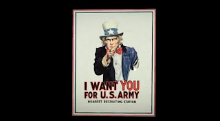 We instantly know as soon as we start
watching the title sequences that it will be set in wartime as we are
shown an iconic poster of Uncle Sam pointing at us. At that point we
will also know that it will be set in America as this is an iconic
American poster and Uncle Sam is an iconic American figure. The music played sounds quite heroic
suggesting it could be about a war hero. It also sounds adventure-y
connoting it could have adventure features. It’s quite an upbeat
song that doesn’t sound dark which suggests that it’s not going
to be a dark film. The music could be considered quite fanfare like,
which is associated with wartime and going to war linking in with
what I said earlier.
We instantly know as soon as we start
watching the title sequences that it will be set in wartime as we are
shown an iconic poster of Uncle Sam pointing at us. At that point we
will also know that it will be set in America as this is an iconic
American poster and Uncle Sam is an iconic American figure. The music played sounds quite heroic
suggesting it could be about a war hero. It also sounds adventure-y
connoting it could have adventure features. It’s quite an upbeat
song that doesn’t sound dark which suggests that it’s not going
to be a dark film. The music could be considered quite fanfare like,
which is associated with wartime and going to war linking in with
what I said earlier. Near the beginning a shot of three
hands are held together in the middle, which suggests teamwork. Also,
they are all wearing different costumes; one is wearing a work glove,
one is wearing a suit and one is wearing an American flag costume,
which could also suggest that people from all different classes are
coming together and working together. This could suggest an
underlying theme of the film too – teamwork.
Near the beginning a shot of three
hands are held together in the middle, which suggests teamwork. Also,
they are all wearing different costumes; one is wearing a work glove,
one is wearing a suit and one is wearing an American flag costume,
which could also suggest that people from all different classes are
coming together and working together. This could suggest an
underlying theme of the film too – teamwork.
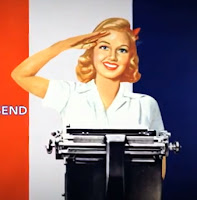
Carrying on with the theme of war, we
are shown a number of army looking aeroplanes,
suggesting/foreshadowing that there could be some action scene
involving aeroplanes somewhere throughout the movie. The fact that a
woman saluting is shown could suggest a romantic element perhaps, and
the fact that she is saluting could suggest she is part of the
team/army.
 Around the middle of the title sequence
we are shown a hand in a glove with a wrench, this could suggest that
there is some sort of manufacturing element somewhere in the film.
Also the fact that it is working on the 'O' in the word 'production'
suggests the making/ manufacturing of something which could have
significance during the movie. The significance of the 'we can do it'
poster could be significant as it could relate to the teamwork
feature again and the fact that it's a woman could suggest that a
woman succeeds in doing something important. The showing of many
flags of the world could connote that many countries are involved
throughout the film, and the fact that the USA flag is at the front
shows that it is the main country and maybe the most important
throughout.
Around the middle of the title sequence
we are shown a hand in a glove with a wrench, this could suggest that
there is some sort of manufacturing element somewhere in the film.
Also the fact that it is working on the 'O' in the word 'production'
suggests the making/ manufacturing of something which could have
significance during the movie. The significance of the 'we can do it'
poster could be significant as it could relate to the teamwork
feature again and the fact that it's a woman could suggest that a
woman succeeds in doing something important. The showing of many
flags of the world could connote that many countries are involved
throughout the film, and the fact that the USA flag is at the front
shows that it is the main country and maybe the most important
throughout.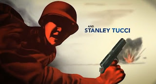
The fact that an explosion illustration
is shown could foreshadow events that happen later in the film. Not
only this, the colour red, used on the person at this point signifies
danger and evil, but it could also suggest a romantic element in the
film.
'what about a nice hot cup of freedom?'
could signify something in the film, perhaps someone gets a sense of
freedom from doing something. The fact that this is shown could maybe
show that it's important.
The fact that all the different parts
of the title sequence join up in some way could show a sense of
merging between characters and that different people will join up
together.
Overall, I think most of the things
shown in the sequence were shown for foreshadowing purposes, to
subtly let the audience know what might happen during the film. Also,
to set the setting, the period of time and the genre.
Friday, 16 November 2012
Fight Sequence with foley sound
This is the final video with foley sound added in to enhance sounds, such as punches and slaps. We used food items such as meat, carrots, celery and a melon to re-create or enhance the sounds in the clip. We used a range of camera angles for effect too, to make the video more interesting. Doing this, we learnt how to create effective foley sounds, to make the sounds in the video more realistic. We also improved our editing skills and knowledge of using final cut pro.
Subscribe to:
Posts (Atom)