While reviewing our clips that we had filmed, and begun to to decide which we would use, and how we would edit them, we noticed that we did not have a sufficient amount of shots to use for placing typography on - as we wanted to place our titles on clips of the scenery. We realised as a group, that we would need to go back to the woods and get the necessary shots for the titles.
We decided to go out during lesson time, due to making it easier for us to collect the equipment we need, and it would make it easier for us to all meet up and plan due to obviously being in the same classroom. Once we planned and collected the equipment, we set out to visit the woods again. When we arrived, we begun exploring the different locations in the woods, to get the best possible shots for out title sequence, and to make the shots diverse.
We faced the problem of difficult weather conditions, which left the floor full of puddles and mud, and I occasionally got 'attacked' by branches and stinging nettles - but we braved this and got the shots we needed and this time, made sure we had as many shots as possible so we wouldn't have to return to the woods anytime soon.
Friday, 11 January 2013
Asking the audience

We compiled this tally chart and asked some people what font they liked the best out of the top six ones we chose. We managed to choose these fonts because they all had that creepy, distorted look that we wanted. We realised that with our name, we had to be careful with what font we chose. This is because if we chose a different style, the whole audiences perception of the film could be changed and they may think that it is of a different genre. Font four received the most votes, and it was also the one that we liked the most so it was the one that we went with.
Tuesday, 8 January 2013
Early font decision making
When choosing the font for the title of our film we went to a well known font site we had previously used called dafont as it has a wide range of fonts available, separated into categories.
We experimented with seeing how different font types portrayed different moods and connotations.

We felt this type font connoted a sense of disorientation which suits our film however, it does not signify danger or horror which is crucial as to create a sense of fear amongst our audience.
This font we felt held too many sci-fi connotations which is not the genre of our film, therefore we felt it was unsuitable.
This font we felt was too simplistic and had soft edges which totally contrasts against the idea for our film.

We felt this font was more suited to a film of a fantasy film and already reminded us of the Harry Potter logo.

We felt this font was the most suited to our film as it holds connotations of danger and horror as it looks distorted and as could be perceived as blood. We are going to find similar fonts to this and then create a survey for people to choose their favourite font.
Monday, 31 December 2012
Choosing a Film Studio
We needed to choose a film studio to produce our films. We looked at popular horror film production companies that also produce similar films to ours. We needed it to be right for our genre, target audience, style and themes. We did some research and found that Hammer and Lionsgate were popular horror film production companies and decided to look at those two. We looked at their portfolio of films and their websites to see whether they would be suitable.
Firstly we looked at the Hammer Films website:
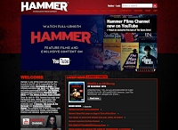


The film 'The Woman in Black' was shown on their website, which we had all heard of and knew made a fairly good profit when it was in the cinema. We looked for other films that we recognised but the other films weren't as recognisable and we'd never heard of them, which started to make us think this wasn't the right film studio.
We looked at the Lionsgate website afterwards:

We immediately liked this website as it was also dark and eery and had a huge advert for 'Texas Chainsaw 3D' which, is a very well known horror film franchise. This gave us a good impression immediately. We looked into other films that Lionsgate had produced and there were some big names like 'The Hunger Games'. That film, even though wasn't a horror film was a massive hit at the cinema, meaning this production studio would have the sufficient budget for our film and would be able to get it a lot of public attention. This is a perfect advantage as we need a lot of promotion going into it as we have decided on a cast of unknown actors. Overall we decided to choose Lionsgate as our production company as we believed it would be able to provide us with the commercial success we hope for, because it is much more a well known company.
Saturday, 29 December 2012
Filming our sequence part 2


Friday, 21 December 2012
Behind the Scenes shots
 |
| Kate filming |
 |
| Me positioning the camera in the correct place |
 |
| me seeing how the shot would look |
 |
| Kate working out where to film |
Location shots

These are some of our location shots that we took whilst we filmed on location. As location person I felt these locations were suitable as with the right colour changes in final cut they would have the right dark and creepy look we wanted to achieve. I liked the positioning of the trees (fallen down tree, trees dotted around) as I thought that these gave the location a more eery look to it. We all felt that this was the perfect location as it was similar to what we'd imagined and discussed what we wanted it to look like.
Subscribe to:
Posts (Atom)