Before we begin to edit our title sequence it is important we researched the order titles appear. We did this in class, analysing the Catch Me If You Can title sequence, establishing the order each title appeared. We then applied the order to fit our film Hypnosis. We decided to also view some title sequences, and see the order in which there titles appear and base it around what we notice. We also tried to follow the codes and conventions that arise with the order of the titles.
This is the order in which our credits will appear in our sequence:
1 - Studio logo - Lionsgate
2 - Production company - A Lionsgate production
3 - Producer - An Oren Peli film
4 - Film title - Hypnosis
5 - Actor name - Lucy Ford
6 - Actor name - Dylan Webb
7 - Actor name - Kate Kurton
8 - Actor name - Alex Easlea
9 - Actor name - Simone Chapman
10 - Casting - Nancy Nayor (worked on The Grudge)
11 - Costume designer - Kristin Burke (worked on Insidious)
12 - Music - John Kurlander (worked on Woman In Black)
13 - Editor - James Cowan (worked on The Possession)
14 - Director of Photography - Daniel Pearl (worked on Friday the 13th
15 - Writers - Jon Spaihts (worked on Prometheus)
16 - Director - Oren Peli
Thursday, 17 January 2013
Creating the titles
To create the titles, we decided to use Adobe After Effects due to being sort of familiar with After Effects, and looking into other After Effects videos being creating, we noticed they looked exceptionally professional and decided this software would be best for us. Dylan has made the titles and animations and this is how he did it.
This is how Dylan made the title for 'Lionsgate Pictures Presents':

Firstly, he had to create a new project. He did this by going to 'File' then 'New' then 'New Project'. Once there, all he had to do with click on the button.

After that he had to place the video he was going to edit for the title, into After Effects. He did this by selecting 'Edit' at the top, then going to 'Import' and finally going to 'File'.
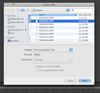
Once selecting 'File', it brought up a menu with the video clips he can use for the placing the titles onto. To select one, he had to click on the once he wanted, which was number two, then click 'Open'.

This then placed the clip into After Effects, and will now allow him to drag it into the editor and begin working on it.
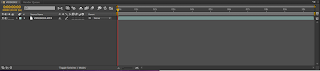
This is what it looks like once it has been dragged into the editor.

And here is the video preview for the clip once it has been placed into the editor.

Now he had to add in the text to display the title 'Lionsgate Pictures Presents'. To do this, he had to go to the editor where the video had been placed, right click on the mouse, then click 'New' and then 'Text'.

Once the video and text had been placed into the editor and positioned, He then moved onto adding the effect to the text to make it animated. To do this, there was a little menu next to the video that stated 'Effects & Presents'. Once there, I found the effect he wanted called 'Evaporated'.

Then he dragged over the effect on top of the text layer, let it load properly, then played it to see how it worked. This is what the effect looked like.

After viewing and sorting out any necessary tweaks to the text animation, he then had to export the clip so it would be suitable for Final Cut Pro. To do this, he had to go to 'File' again, then to 'Export' and 'Add to Render Queue'.

This then took him to this menu, where he can change the name, format and anything else.

After all that, all he had to do was click 'Render' then his clip would be complete and be used for our title sequence.
This is how Dylan made the title for 'Lionsgate Pictures Presents':

Firstly, he had to create a new project. He did this by going to 'File' then 'New' then 'New Project'. Once there, all he had to do with click on the button.

After that he had to place the video he was going to edit for the title, into After Effects. He did this by selecting 'Edit' at the top, then going to 'Import' and finally going to 'File'.

Once selecting 'File', it brought up a menu with the video clips he can use for the placing the titles onto. To select one, he had to click on the once he wanted, which was number two, then click 'Open'.

This then placed the clip into After Effects, and will now allow him to drag it into the editor and begin working on it.

This is what it looks like once it has been dragged into the editor.

And here is the video preview for the clip once it has been placed into the editor.

Now he had to add in the text to display the title 'Lionsgate Pictures Presents'. To do this, he had to go to the editor where the video had been placed, right click on the mouse, then click 'New' and then 'Text'.

Once the video and text had been placed into the editor and positioned, He then moved onto adding the effect to the text to make it animated. To do this, there was a little menu next to the video that stated 'Effects & Presents'. Once there, I found the effect he wanted called 'Evaporated'.

Then he dragged over the effect on top of the text layer, let it load properly, then played it to see how it worked. This is what the effect looked like.

After viewing and sorting out any necessary tweaks to the text animation, he then had to export the clip so it would be suitable for Final Cut Pro. To do this, he had to go to 'File' again, then to 'Export' and 'Add to Render Queue'.

This then took him to this menu, where he can change the name, format and anything else.
After all that, all he had to do was click 'Render' then his clip would be complete and be used for our title sequence.
Media Feedback and changes I made
Things that I needed to improve and how I changed them:

-Spelling and Grammer in places is wrong. I went through my blog checking and rectifying my spelling and grammer as best as I could.
-Too many short paragraphs/sentences. I added more into my paragraphs and then condensed some of them together to make larger paragraphs.
-Too many unnecessary labels. I removed any unnecessary labels.
-Move some of my posts around to be in the correct order
Friday, 11 January 2013
Filming our Sequence Part 3
While reviewing our clips that we had filmed, and begun to to decide which we would use, and how we would edit them, we noticed that we did not have a sufficient amount of shots to use for placing typography on - as we wanted to place our titles on clips of the scenery. We realised as a group, that we would need to go back to the woods and get the necessary shots for the titles.
We decided to go out during lesson time, due to making it easier for us to collect the equipment we need, and it would make it easier for us to all meet up and plan due to obviously being in the same classroom. Once we planned and collected the equipment, we set out to visit the woods again. When we arrived, we begun exploring the different locations in the woods, to get the best possible shots for out title sequence, and to make the shots diverse.
We faced the problem of difficult weather conditions, which left the floor full of puddles and mud, and I occasionally got 'attacked' by branches and stinging nettles - but we braved this and got the shots we needed and this time, made sure we had as many shots as possible so we wouldn't have to return to the woods anytime soon.
Asking the audience

We compiled this tally chart and asked some people what font they liked the best out of the top six ones we chose. We managed to choose these fonts because they all had that creepy, distorted look that we wanted. We realised that with our name, we had to be careful with what font we chose. This is because if we chose a different style, the whole audiences perception of the film could be changed and they may think that it is of a different genre. Font four received the most votes, and it was also the one that we liked the most so it was the one that we went with.
Tuesday, 8 January 2013
Early font decision making
When choosing the font for the title of our film we went to a well known font site we had previously used called dafont as it has a wide range of fonts available, separated into categories.
We experimented with seeing how different font types portrayed different moods and connotations.

We felt this type font connoted a sense of disorientation which suits our film however, it does not signify danger or horror which is crucial as to create a sense of fear amongst our audience.
This font we felt held too many sci-fi connotations which is not the genre of our film, therefore we felt it was unsuitable.

This font we felt was too simplistic and had soft edges which totally contrasts against the idea for our film.

We felt this font was more suited to a film of a fantasy film and already reminded us of the Harry Potter logo.

We felt this font was the most suited to our film as it holds connotations of danger and horror as it looks distorted and as could be perceived as blood. We are going to find similar fonts to this and then create a survey for people to choose their favourite font.
Subscribe to:
Posts (Atom)