We needed to choose a film studio to produce our films. We looked at popular horror film production companies that also produce similar films to ours. We needed it to be right for our genre, target audience, style and themes. We did some research and found that Hammer and Lionsgate were popular horror film production companies and decided to look at those two. We looked at their portfolio of films and their websites to see whether they would be suitable.
The film 'The Woman in Black' was shown on their website, which we had all heard of and knew made a fairly good profit when it was in the cinema. We looked for other films that we recognised but the other films weren't as recognisable and we'd never heard of them, which started to make us think this wasn't the right film studio.
We looked at the Lionsgate website afterwards:
We immediately liked this website as it was also dark and eery and had a huge advert for 'Texas Chainsaw 3D' which, is a very well known horror film franchise. This gave us a good impression immediately. We looked into other films that Lionsgate had produced and there were some big names like 'The Hunger Games'. That film, even though wasn't a horror film was a massive hit at the cinema, meaning this production studio would have the sufficient budget for our film and would be able to get it a lot of public attention. This is a perfect advantage as we need a lot of promotion going into it as we have decided on a cast of unknown actors. Overall we decided to choose Lionsgate as our production company as we believed it would be able to provide us with the commercial success we hope for, because it is much more a well known company.
We had to film the destruction of the photos, I couldn't show all of the photos destroyed as most of them had been cut up and had fake blood on them. Me, Dylan and Kate went into my garden and burnt one of the photos, submerging one in water, cutting one, slicing one with a small knife and splatting blood on it and dropping small rocks on one. Each photo and the way it is destroyed signified the way each character dies in the film. It's like a foreshadowing events later in the film.
These are some shots from behind the scenes when we filmed. In the pictures you can see Kate, as the cinematographer, working out what the shot would look like, where to position the camera and filming some of the clips. Also there are some pictures of me also positioning the camera and seeing what the shot would look like when it was filming and seeing if it would look effective. Dylan was the one taking the photographs however, both he and Kate helped me decide on the location and he also did some filming too. As the director, he made effective decisions on what to film and how to film it.
These are some of our location shots that we took whilst we filmed on location. As location person I felt these locations were suitable as with the right colour changes in final cut they would have the right dark and creepy look we wanted to achieve. I liked the positioning of the trees (fallen down tree, trees dotted around) as I thought that these gave the location a more eery look to it. We all felt that this was the perfect location as it was similar to what we'd imagined and discussed what we wanted it to look like.
To film our sequence, we had to go to the set location we selected prior to filming. We decided, since we were doing the horror/slasher genre, we wanted a creepy, eery location. We picked the woods as this fit the criteria of the location we wanted. The woods are often a typical setting for a horror film making it instantly recognisable. Before going off to our location, we made sure we had all the equipment, which we were able to do with some complications; such as problems with the weapon, tri-pod issues and rope issues. We managed to resolve them in the end with Simone providing the knife, me being able to locate a tri-pod (we forgot to get one from school) and kate finding some rope to use during filming. Once we got to our location, we had to choose the right location in the woods that would fit our imagination of our woods. We selected a location that was not over crowded by trees, and had a decent amount of walking space. Since I was in charge of location, I had the decision where we started filming, with the help and opinions of Kate and Dylan. Kate set up the positioning of the camera, and decided where people should enter and leave and the different camera angles, whereas Dylan being the director, oversaw these decisions and had to see if the decisions being made where ultimately good enough - which all were and there were no problems.
Once we had picked the location we started to film the walking, and running clips for our film. We took lots of shots so we had lots of choice when we began editing and so we wouldn't have to go back again. Once we finished filming, we looked through and watched the clips to see if they looked good.
Production Plan Filming Schedule: Date: December 16th Location: Oxleas Woods Times: 2:00 Meet at my house 2:10 Leave my house and get bus to Oxleas Wood's 2:30 Take loaction shots 2:45 Film scenes of the "killer" cutting rope 3:00 Film scenes of "killer" walking through woods 3:15 Film scene where group of friends "enter" the woods 3:30 Film scenes of running through woods in panic
Things needed: Rope (Provided by Kate) Torch(Provided by Kate) Fake knife (Provided by Simone) Camera and tripod (Provided by Lucy) Bags to use as props (Provided by Dylan) Must ensure costume is dark and suitable for camping
Problems that may arise: 1.Bad weather 2.Camera running out of battery 3.Location is not suitable How they will be resolved: 1.We have ensured we have chosen a dry day to film by checking the weather report 2.We have brought spare batteries along 3.We have organised a backup location in the Abbey woods
As a group we discussed the possibility of using a real axe when shooting as we all thought it would look realistic and eery, however, taking an axe out into a public woods would probably cause some unwanted attention from the police and public. We then did some extensive research into looking for a fake alternative. We found some realistic ones but they were significantly expensive.
This is the only fairly realistic fake axe we could find during our research, we liked that it was under £3 however, we think that it looked very fake and wouldn't give the look that we wanted. We thought that it wouldn't give the scare factor.
We considered changing our weapon and looked into buying a fake chainsaw. This seemed more promising however we realised that we could not wait for delivery if we wanted to film the day we had planned.
We came to the conclusion we would use a fake knife which would still work effectively on camera but would be much safer and easier to get to the woods and back.
In our group, we had to take specific roles. The roles were director/producer who basically had control over everything, cinematography who checked the camera angles, lighting and so on and someone had to be in control of the props, make-up and location. The role Dylan was given was: Director/Producer The role I was given was: Props, make-up, location The role Kate was given was: Cinematographer
Saul Bass was an American graphic designer. He is one of the most recognised and revolutionary title sequence and poster designers in the film industry. Before Saul Bass' work title sequences were often very basic and reminiscent of end credits; where the names just roll up on a plain background. Bass' colourful, simple geometric shapes were often symbolisms which, even on their own delivered a powerful messages. His work changed the way title sequences were viewed forever, as from then on they were much more creative and visually stimulating.
Saul Bass was born on the 8th of may 1920 and he studied at the Art students league in Manhattan later in his life. He then worked as a freelance graphic designer in his early career, before he worked on bigger films. He was so popular because he had the ability to capture the mood of the whole film using only simple shapes and lines. He has designed posters for many famous films and they all have a similar look making his work iconic and easy to spot. He also ended up producing over sixty title sequences. He had many great collaborations with familiar and famous directors such as Alfred Hitchcock and Michael Scorsese, making his work more widely recognised. He changed the way people viewed title sequences by making title sequences something that not only stated names of crew and cast and the name of the film, But something that presented them in a creative way. Often Bass' title sequences held metaphors that suggesting what would happen during the film, or it being a synopsis of the while film itself.
Our genre for our film 'Hypnosis' is horror and so we had to look into the codes and conventions of horror films. This is so we can make the best title sequence as possible, ensuring we follow all of the codes and conventions.
The typical iconography of a horror film is: Props:
Knives
Mask,
Crucifix
Sharp objects that penetrate or dismember
Cloak
Blood
Two-way mirrors
Iconic elements:
Full moon
Graveyards
Large houses
Fog
Macabre
Bad weather
Coffin
Typical settings include:
Suburban areas
Forrest/woods
Forbidden places
Cellars
Enclosed spaces
Deserted areas
'Off-map' locations
Country lanes
Typical characters that appear in theses films include:
what went well:
We got mostly positive feedback from our peers and Miss Whittaker, they said that they thought our film idea had definite potential and could turn into a great title sequence. They also said that we followed codes and conventions of the horror genre well; such as using unknown actors, the setting and the mystery killer. We were told it was a unique and creative idea that they would go and watch at the cinema. Also, our target audience was said to be spot on.
what criticism we received: Our profit was said to be too high compared to the films that we researched. They wanted to see what unknown actors we would use so they could picture them in their mind. Miss Whittaker didn't think our name was scary enough for a horror. We will take all of these points and change them accordingly to make sure our film is the best it could be.
We prepared our pitch for our film idea using Prezi. We all contributed to presentation, Kate did the typing of all the different sections of the prezi such as; the narrative, target audience, cast list etc. Dylan did the research into other similar films, he looked at their budgets and worldwide profit so we could base our one on it. Finally, I did some research into fonts that we could use for our film and created a small animation as an example of what it could look like. I also helped with the research into similar films and contributed with what we wrote.
We were asked to get into our coursework groups, I went with Kate and Dylan. We discussed our film ideas that we came up with over half term and decided on Dylan's idea of an invisible killer who can control minds as we had a few ideas for the title sequence and we all liked the idea. We developed his idea further into something that we believed we could easily work with.
We started to look at type fonts and the importance of it in the film industry. We were shown different type fonts and had to identify what film they came from. This confirmed to us how iconic certain fonts can be. Then we had to analise a second title sequence as part of our research and planning. Finally, we learnt about the important codes and conventions of title sequences preparing us for our coursework.
1. "Words and lettering played an enormous role in films of the silent era. Film titles made their appearance in the earliest silent films..." I picked this because i found it interesting how far back title sequences go and were developed. I thought it was cool how these film titles could have been the early development of todays title sequence. 2. "Over time, the very appearance of white-on-black title lettering became a visual trope..." I picked this because I found it interesting how popular white text on black background was so popular and now that I think about it, if I saw a white title on black background it would automatically strike me as an old fashioned film title, showing how iconic it was. 3."Maurice Binder worked on the title designs of 14 films about Agent 007, including the first episode, “Dr. No” (1962). Binder created the famous gun-barrel sequence, which became a signature for the Bond series" I picked this because I found out how far back the famous gun-barrel look on bond films went. It's interesting to think how these creations last so long and become icons in film. 4."The revolutionary title sequence for “Se7en” (1995) by Kyle Cooper was named by New York Times Magazine as “one of the most important design innovations of the 1990s” I picked this because I thought it was interesting how important this title sequence was in the history of the film industry. If interesting to think what title sequences would be like today if that title sequence wasn't around.
5. One thing these individuals have in common is a drive to find a strong metaphor and tell an exciting story with their sequences.
This is referring to the disney and pixar title sequence creators. I picked this because I learnt that all of their animated movie title sequences have a strong meaning in them, and I think that the way they have done this is clever as it must be difficult to create this in an animation.
At the beginning of the Halloween 3 title sequence a flickering effect is visible. This reminds me of a old fashioned television and therefore suggests that something is going to be portrayed to television viewers. Also, it could suggest that a television has some sort of importance somewhere in the film. The flicker is also symbolic for mystery as you can not see what is actually going on and therefore it will be hard to work things out.
The music in the first part of the title sequence is very high and quite distorted, and doesn't seem to fit in with the film's genre. This could suggest that this film may be unexpected and have scenes that you have never seen before in horror films. The blue text and the orange background are quite contrasting colours connoting that things wont match up in the film, also suggesting mystery.
The music changes into a quite low hum which sounds dark and mysterious suggesting what the mood and tone of the film is going to be. The music conveys the genre the most due to the distorted and mysterious/atmospheric music making the whole scene more creepy. It makes the audience quite tense as they can't tell what it happening and the music adds to this tension.
Another point is that throughout the whole of this sequence, something is slowly being revealed to us using the orange lines. We don't find out what it actually is until the end suggesting that this might be the case in the film; that small parts of a mystery are shown to us throughout the film but we don't find out the answer to it until the very end. The fact that the orange lines are then being cut out again could maybe suggest that there maybe stabbings in the film as the cutting of the lines could resemble a character being cut.
The colour orange shown throughout the sequence is always linked to halloween, which is the name of the film too. So, if someone didn't know what the film was called the colour orange could suggest the theme of halloween to them. This along with other features too, such as the music and the fact that the end image is of a jako lantern.
as you can see here, the building up of the orange lines create a jako-lantern, shown at the end.
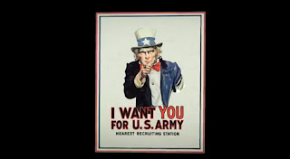
We instantly know as soon as we start
watching the title sequences that it will be set in wartime as we are
shown an iconic poster of Uncle Sam pointing at us. At that point we
will also know that it will be set in America as this is an iconic
American poster and Uncle Sam is an iconic American figure. The music played sounds quite heroic
suggesting it could be about a war hero. It also sounds adventure-y
connoting it could have adventure features. It’s quite an upbeat
song that doesn’t sound dark which suggests that it’s not going
to be a dark film. The music could be considered quite fanfare like,
which is associated with wartime and going to war linking in with
what I said earlier.
Near the beginning a shot of three
hands are held together in the middle, which suggests teamwork. Also,
they are all wearing different costumes; one is wearing a work glove,
one is wearing a suit and one is wearing an American flag costume,
which could also suggest that people from all different classes are
coming together and working together. This could suggest an
underlying theme of the film too – teamwork.
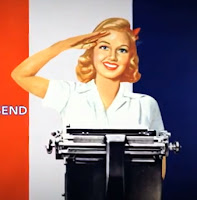
Carrying on with the theme of war, we
are shown a number of army looking aeroplanes,
suggesting/foreshadowing that there could be some action scene
involving aeroplanes somewhere throughout the movie. The fact that a
woman saluting is shown could suggest a romantic element perhaps, and
the fact that she is saluting could suggest she is part of the
team/army.
Around the middle of the title sequence
we are shown a hand in a glove with a wrench, this could suggest that
there is some sort of manufacturing element somewhere in the film.
Also the fact that it is working on the 'O' in the word 'production'
suggests the making/ manufacturing of something which could have
significance during the movie. The significance of the 'we can do it'
poster could be significant as it could relate to the teamwork
feature again and the fact that it's a woman could suggest that a
woman succeeds in doing something important. The showing of many
flags of the world could connote that many countries are involved
throughout the film, and the fact that the USA flag is at the front
shows that it is the main country and maybe the most important
throughout.
The fact that an explosion illustration
is shown could foreshadow events that happen later in the film. Not
only this, the colour red, used on the person at this point signifies
danger and evil, but it could also suggest a romantic element in the
film.
'what about a nice hot cup of freedom?'
could signify something in the film, perhaps someone gets a sense of
freedom from doing something. The fact that this is shown could maybe
show that it's important.
The fact that all the different parts
of the title sequence join up in some way could show a sense of
merging between characters and that different people will join up
together.
Overall, I think most of the things
shown in the sequence were shown for foreshadowing purposes, to
subtly let the audience know what might happen during the film. Also,
to set the setting, the period of time and the genre.
Kate, Dylan and I created this fight sequence. Dylan filmed on the day, while Kate and I starred in it. After we'd filmed we all took turns to edit all the clips together, then we all helped with creating foley sounds, and then Dylan and I edited in the foley sounds.
This is the final video with foley sound added in to enhance sounds, such as punches and slaps. We used food items such as meat, carrots, celery and a melon to re-create or enhance the sounds in the clip. We used a range of camera angles for effect too, to make the video more interesting. Doing this, we learnt how to create effective foley sounds, to make the sounds in the video more realistic. We also improved our editing skills and knowledge of using final cut pro.
Straight away we know that there is going to be a lot of deaths in this film, and perhaps quite gory ones, as the first scene is someone falling to the ground. A low angle/tilt up shot is used here to get the full affect and it feels like he is going to fall on us as that is where our perspective is. The soundtrack is Metallica, you wouldn't expect this for a zombie film suggesting that it could be a comedy/parody or something that isn't totally serious.
The blood and nudity shown in the opening sequence will make the audience realise that this will probably be echoed in the rest of the film. We know it will be quite gory, risky and maybe even controversial, as some people may get offended by the things shown. This is probably why some gory/nude things are shown in the opening sequence, maybe as a warning what will come up later in the film.
The titles and credits are in a red bold font, the red could suggest death, blood or danger. Also they look quite interactive as when the characters run/fall in them they look as if they are smashing. This could suggest the action that will happen throughout the film as a lot of things will probably get smashed up. In the first scene the title is placed as if it is the sign on the outside of the building too, which is quite clever, but also discrete.
By the time we've seen most of it we will probably establish that the genre is Zombie-Comedy due to the music and the editing mainly; the slow-motion editing looks quite humorous and comedic and the fact that the people are getting chased by the zombies. Due to the slow-motion we can see their facial expressions more which is quite funny.
The film looks as if it is set in an american city as there are lots of features that big cities have; prison at the beginning, fire department, school, strip club etc. The fact that it looks quite bright/sunny/hot there also confirms the location. The fact that it is so bright could contrast with the quite dark main feature; zombies. This could also add to the comedy feel of the film. The film looks quite modern, so it could make audiences imagine if that would be what it would be like if this happened now in real life.
This opening is quite good as raising enigmas as we are only shown clips that are in the peak of action and we don't know how it got to that point or how the zombie virus came about, so will we hence want to watch the rest and find out.
Tuesday, 23 October 2012
Evaluation:
-What went well;
I think that overall most things went well. The scene looks flowing when it cuts from clip to clip, which I think was not only as a result of the editing, it was the way we filmed it too as we ensured the camera was in the right place and the way that we filmed something in one clip was done the same in the next clip, for example, the positions we were in and placements of things like hands. I like the fact that the camera we used was of a very high quality which enhanced the filming and made it look more professional. I also think that our video has added creativity and humour in too so it isn't as simple as the brief stated. Nether-the-less, it still meets the brief and we did exactly what it told us to do.
-What could be improved;
I think that most things went well however there are a few things that we could have improved or would improve is done again. Firstly there is a bit in the video where the door went from being open to being almost closed without of any film evidence of this, I thought this didn't look right. We also broke the framing rules as Kieran's face was cut out of the shot at times.
-What I have learnt and would apply elsewhere;
I have learnt how to correctly apply the 180 degree rule, so that it looks effective and realistic. I have also learnt the skills to make the video look flowing and real. When doing future projects i can use the continuity effect to make my videos look professional and effective.


